
Last Updated on 24 Nov 2025
This is the EFGH Visual Brand Guideline.
It lays out how we show up in the world — from our logo and typography to our color palette, layout, and imagery. It defines the look and feel that makes us instantly recognizable and unmistakably us.
This guide is here to help anyone creating for our brand — whether you’re designing a social post, a website, or a pitch deck. It ensures everything looks consistent, intentional, and on-brand, no matter where or how it's seen.
So whether you're part of the team or a creative partner — welcome. Let’s make great things together. Dive right in.
Table of Content
05
Typography
01
About EFGH
Mission
To support the underinsured and underprivileged— what we call “the man on the street”
— by building systems that unlock long-term value at scale.
Whether through embedded protection, accessible credit, or better digital infrastructure, our mission is to make economic empowerment part of the everyday journey.
Our Philosophy
We’re not a solution. We’re a Value Creation Platform.
Value shouldn’t be a bonus — it should be built in.
We believe that truly scalable impact comes from embedding value into every touchpoint: onboarding, transactions, operations, and ecosystems.
EFGH exists to help partners do just that. Not through one-off tools or short-term campaigns, but by designing cohesive systems that support growth, inclusion, and retention — across platforms, products, and people.
Our Northstar
Create Value. For Tomorrow.
“Create Value” means we focus on outcomes: protection, access, revenue, retention. Real gains, not vanity metrics.
“For Tomorrow” reflects our commitment to long-term impact — especially in markets where infrastructure is still emerging and inclusion is still uneven.
We build for sustainability, not just scale. We create value that lasts.
02
Personality
Just like people, brands have personalities. Ours? Confident but approachable. Purposeful, but never preachy. Bold when needed, calm when it counts.
This guide helps everyone channel the same spirit — whether you're designing a page, crafting a headline, or briefing a team. Because consistency isn’t about being rigid — it’s about being unmistakably us.
Confident
Purposeful
Approachable


2a
Tone of Voice
Clear, Not Cold
We speak with clarity and direction, but never sound robotic or distant. Our tone is assertive, concise, and structured — yet always warm and human. This balance reflects our confidence in what we do while keeping our message accessible and relatable. Use this tone when giving instructions, writing headlines, or sharing important updates.
“ConnectSure™ is our embedded insurance system — designed to help insurers and platforms deliver protection without friction.”
✓ Why it works:
It’s clear, to the point, and easy to understand. It explains what the product is and how it helps — no fluff, no jargon.
“Our embedded insurance module is engineered with middleware architecture to deliver compliance-driven, modular, omnichannel protection across partner ecosystems.”
❌ Why it doesn’t work:
It's overloaded with technical buzzwords that confuse rather than clarify. The message gets lost in complexity, sounding distant and overly technical — not approachable or purposeful.
Friendly, Never Fluffy
We keep it conversational and engaging, but always with substance. Our voice is genuine and approachable, with just the right amount of charm — never overly casual or forced.
This tone helps us build trust with small businesses and partners who value authenticity. It’s perfect for user engagement, social media, or simplifying complex ideas.
“Use one tool or combine them into a system — everything we build is designed to scale with your needs.”
✓ Why it works:
It's friendly, flexible, and focused on the user. It encourages without overselling. You get a sense that EFGH is here to support, not overwhelm.
“Integrate disparate product stacks in a modularized ecosystem to maximize resilience and operational throughput across stakeholders.”
❌ Why it doesn’t work:
This sounds like corporate jargon for the sake of sounding smart. Phrases like "resilience and operational throughput" don’t connect emotionally or practically with real users. It feels impersonal and unclear.
Focused, With Heart
We communicate with intention and care — everything we say has a purpose. Our tone feels mission-driven and grounded, without being preachy or self-important.
It reflects our drive to make a meaningful impact while respecting our audience’s time and attention. Use this tone when discussing our mission, sharing values, or introducing new initiatives.
“EFGH exists for one reason: to enable growth in markets that are anything but simple.”
✓ Why it works:
It communicates purpose with clarity and humility. There’s heart behind the message, and it reflects EFGH’s mission in a grounded, authentic way.
“We are deploying innovative infra-led frameworks to catalyze regional insurance penetration through targeted distribution in complex emerging markets.”
❌ Why it doesn’t work:
While technically accurate, it sounds corporate and detached. It overuses complex, formal language that obscures meaning and feels self-important — losing the human, purposeful tone EFGH aims for.
03
Logo Usage
This section provides clear rules on how to apply the EFGH logo across digital and print materials. For consistency and brand integrity, all final usage must be reviewed and approved by the creative or marketing team before any public release.
3a
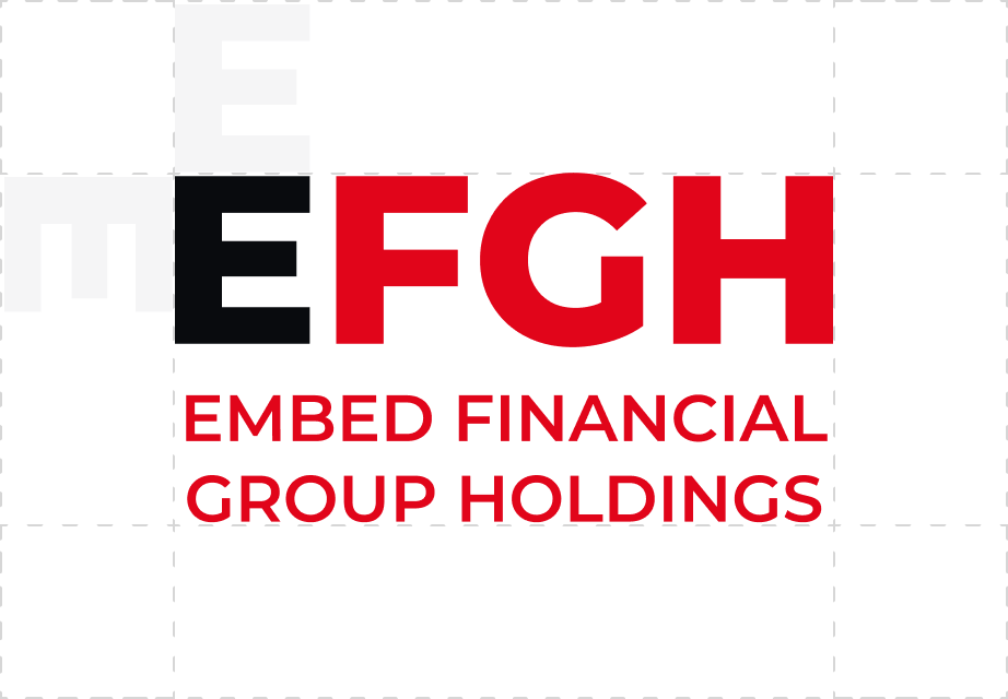
Master Logo

3b
Clearspace


Primary Logo - Red Logo on white background

Reverse Logo - White Logo on red background

Secondary Logo on black background: Version 1

Secondary Logo on black background: Version 2

Greyscale Logo on black background.*Only use this if we are placing EFGH logo together with other greyscale logos.

Greyscale Logo on white background.
*Only use this if we are placing EFGH logo together with other greyscale logos.


The EFGH symbol is adapted into a simplified badge for use as a favicon, app icon, or social media profile image. This ensures the brand remains recognizable and consistent, even at small sizes or in digital spaces where the full logo isn’t practical. Our symbol is also designed to fit into different shapes, whether it be a circle or square.
3e
Incorrect Logo Usage


Do not add gradient

Do not stretch

Do not change color

Do not rotate


Do not use on busy background

Do not add effects

Do not apply outline

Do not recreate/retype words
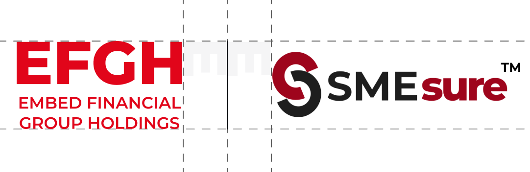
Co-branding Lockups
When we show up alongside our partners, clarity and balance are key. Our logo should sit confidently, with equal respect given to our partners. Use this guide to maintain a consistent, professional presentation across all co-branded materials — especially decks, press kits, landing pages, and digital banners.
HORIZONTAL

VERTICAL
When we show up alongside our partners, clarity and balance are key. Our logo should sit confidently, with equal respect given to our partners. Use this guide to maintain a consistent, professional presentation across all co-branded materials — especially decks, press kits, landing pages, and digital banners.
✓ Equal Prominence
EFGH and partner logos must be treated with visual balance — neither should overshadow the other. Match logo sizes proportionally (based on visual weight, not just pixel width) and align them horizontally unless context calls for vertical stacking.
✓ Placement
Place logos side by side, with EFGH typically leading (left-aligned or top-aligned), unless the partner is the primary host or owner of the asset. Maintain even spacing between logos, following clear space rules for both brands.
✓ Clear Space
Maintain sufficient padding around each logo. At a minimum, use the height of the E in the EFGH logo as the clear space buffer on all sides — and ensure partner logos follow their respective brand guidelines.
✓ Background Control
Use logos only on solid or neutral backgrounds that maintain legibility and contrast. Avoid placing logos over busy imagery or gradients unless cleared by the EFGH creative team.
✓ File Types & Quality
Use vector or high-resolution PNG versions of all logos. Avoid stretching, pixelation, or any distortion. Never alter the color, aspect ratio, or orientation of either logo.
✓ Approval Required
All partnership presentations featuring the EFGH logo must be reviewed by our creative or marketing team prior to any external release. This includes press materials, investor decks, joint campaigns, and digital collateral.
3f
Logo Placement
EFGH partnerships follow three main execution approaches —some more frequently used than others. Each is crafted to achieve a clear objective while upholding the integrity of the EFGH brand.


Title Partners or Co-organizers
Side-by-side placement to show an equal partnership.
Supported by

Supporting Partner or Title Sponsors
Shows how one partner supports another.
Supported by

Multiple Brand Inclusion
Side-by-side placement to show an equal partnership.
3g
Incorrect Co-branding


Too close in space


Unequal sizing


Changing logo colors


Busy or low contrast backgrounds
Merging different logos
exists to help partners do just that. Not through one-off tools or short-term campaigns, by designing cohesive systems


Use in a sentence or body copy
Credit Line
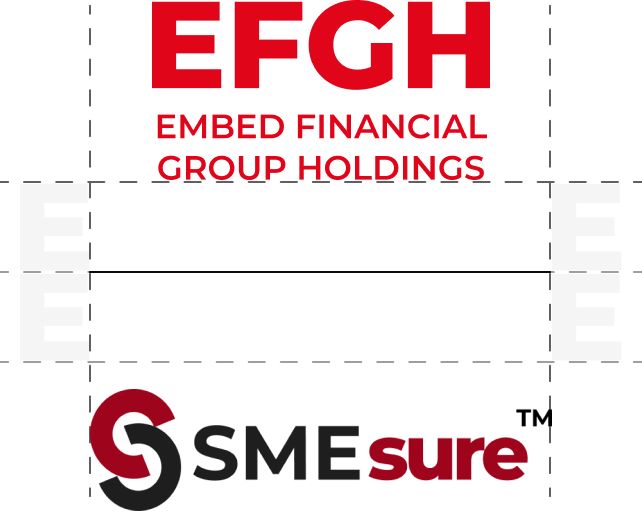
This section provides guidelines for using EFGH in credit lines. Use the width of the E in the EFGH logo as the clear space buffer on all sides. Any new usage or adaptation of sub-brand logos must be reviewed and approved by the creative or marketing team before going live.
HORIZONTAL
Supported by


VERTICAL
Supported by


Multiple Brand Inclusions
Supported by


Sub-brand Logo
This section outlines how to use sub-brand logos consistently and clearly. Any new usage or adaptation of sub-brand logos must be reviewed and approved by the creative or marketing team before going live.

DOWNLOAD

ConnectSureTM Logo


SMEsureTM Logo

GATTM Logo

ConnectSureTM Logo - Reversed- Only on Black Background


SMEsureTM Logo - Reversed- Only on SMEsureTM Brand Red Background

GATTM Logo - Reversed- Only on Black Background
04
Color Palette
This section outlines how to use sub-brand logos consistently and clearly. Any new usage or adaptation of sub-brand logos must be reviewed and approved by the creative or marketing team before going live.
5a
Primary Palette
Red
Hex: #E1051A
RGB: rgb(225 5 26)
White
Hex: #FFFFFF
RGB: rgb(255 255 255)
Black
Hex: #090B0E
RGB: rgb(9 11 14)
5b
Secondary Palette
Dark Grey
Hex: #626262
RGB: rgb(98 98 98)
Grey
Hex: #DDDDDD
RGB: rgb(221 221 221)
Light Grey
Hex: #EFEFEF
RGB: rgb(239 239 239)
SMEsureTM Red
Hex: #9E051C
RGB: rgb(158 5 28)
5c
Gradient Palette
Light Grey Gradient
Beige Gradient
Red Gradient
05
Typography
Typography plays a key role in shaping how people experience the EFGH brand. This section outlines our typefaces, hierarchy, and usage rules to ensure every word looks as intentional as it sounds.
Use this guide to keep our communications consistent and polished.
Montserrat
Primary Sans-Serif (Montserrat Medium)
Montserrat Medium
Aa Bb Cc Dd Ee Ff Gg Hh Ii Jj Kk Ll Mm Nn Oo Pp Qq Rr Ss Tt Uu Vv Ww Xx Yy Zz 1234567890 !@#$%^&*()
Montserrat Semibold
Aa Bb Cc Dd Ee Ff Gg Hh Ii Jj Kk Ll Mm Nn Oo Pp Qq Rr Ss Tt Uu Vv Ww Xx Yy Zz 1234567890 !@#$%^&*()
5a
Sizing
Heading 1: Montserrat Semibold, 40px
Create Value.
For Tomorrow.
Heading 2: Montserrat Semibold, 32px
Embedded Insurance Infrastructure
Heading 3: Montserrat Semibold, 24px
Connectsure
Heading 4: Montserrat Semibold, 20px
Our Solutions
Body Text Regular: Montserrat Medium, 16px
Value shouldn't be a bonus — it should be built in. We believe that truly scalable impact comes from embedding value into every touchpoint: onboarding, transactions, operations, and ecosystems.
Body Text Medium: Montserrat Medium, 14px
Leave a message
Body Text Small: Montserrat Medium, 10px
Insights
Button/Link Text: Montserrat Medium, 18px
Let’s Connect
5b
Variables
For headings on light backgrounds, apply the brand red to highlighted text for added contrast and clarity.To emphasize specific words or phrases, use Sans-serif (Montserrat Semibold) at the same type size.
How Our Platform Works
Variable usage example 1
Create Value. For Tomorrow.
Variable usage example 2
5c
Fallback Font
To ensure visual consistency, a fallback font is provided as an alternative. Use Sans-serif (Calibri Regular) when the primary EFGH font isn’t available—especially in shared slides or platforms that don’t support custom fonts.
Calibri
Fallback Sans-Serif (Calibri Regular)
Calibri Regular
Aa Bb Cc Dd Ee Ff Gg Hh Ii Jj Kk Ll Mm Nn Oo Pp Qq Rr Ss Tt Uu Vv Ww Xx Yy Zz 1234567890 !@#$%^&*()
Calibri Bold
Aa Bb Cc Dd Ee Ff Gg Hh Ii Jj Kk Ll Mm Nn Oo Pp Qq Rr Ss Tt Uu Vv Ww Xx Yy Zz 1234567890 !@#$%^&*()
06
Visuals
6a
Illustrations


Abstract Stroke Art
Illustrations should use thin linework combined with flat colors from the core brand palette (red, white, and black). Avoid gradients, shading, or unnecessary effects. The style should remain minimal and clean.
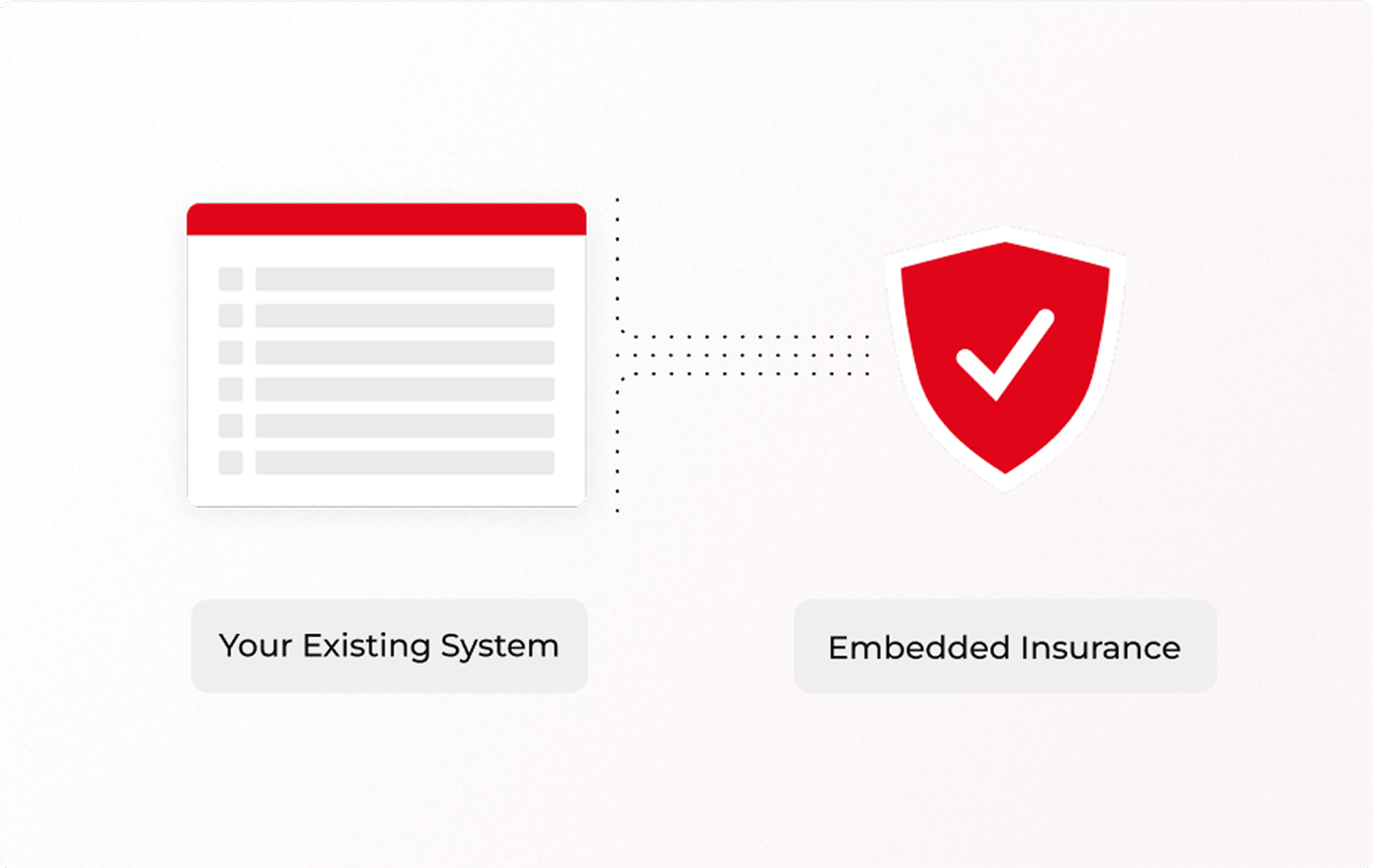
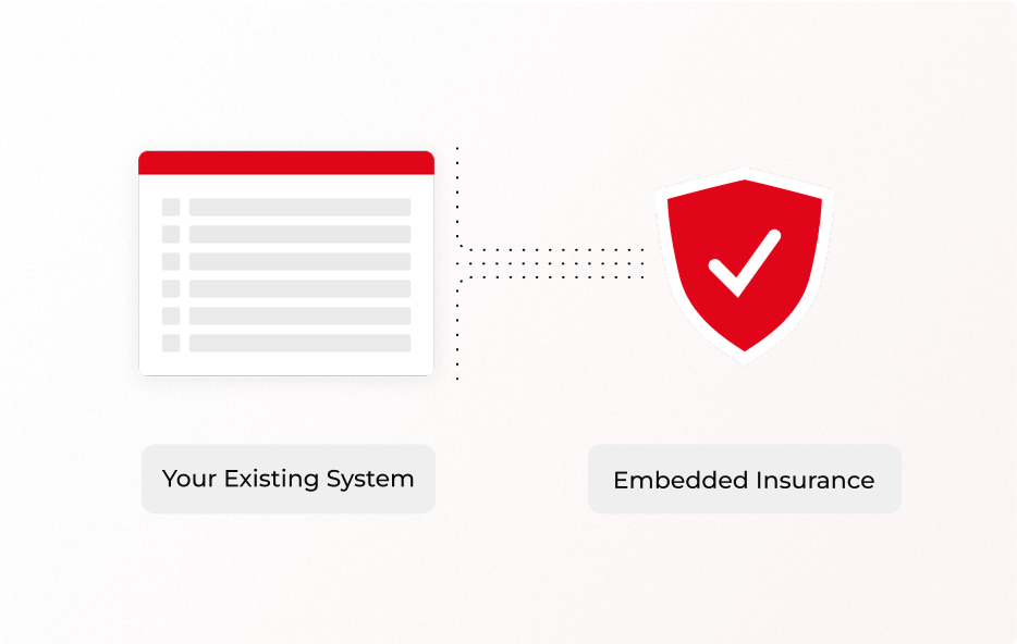
Informative Diagrams
Use simplified, flat-style illustrations with supporting text boxes to communicate concepts clearly. Ideal for explaining workflows, processes, or system components.


Narrative Illustration
Use corporate-style illustrations with flat color fills, consistent linework, and EFGH’s primary color palette. Avoid facial features; focus on dynamic poses and clear, purposeful composition. This illustration style are mostly used for social media.
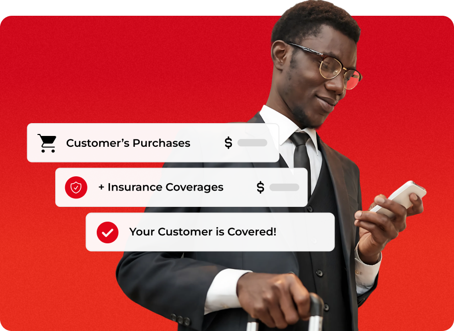
Mixed Media Imagery
Combine real imagery with clean graphic elements to convey information in a human, engaging way. Use visual components to guide viewer attention and add context to the imagery.
6b
Imagery

Balanced & Clean
Photography should have a well-balanced composition, with clear visual on the main object. Content of imagery should be related to EFGH (insurance, business, protection, finance, partnership, teamwork, etc)
Link

Subtle Technology Integration
Photography should include elements of modern technology—computer screens, tablets with data analytics, mobile phone, or other communication/business tools.
Link

Represent Diversity
Imagery should reflect the diverse communities EFGH serves, with a focus on authentic representation of people across Africa and Asia. Showcase inclusive, modern professionals in real business settings.
Link

People with Confidence & Focus
Images should capture real-world scenarios—professionals analyzing reports and teams discussing strategies. This reinforces EFGH’s role in improving businesses using embed insurance.
Link
6c
Graphic Elements

Ellipse Pattern (Radial) - USED IN WEBSITE PAGE HERO
A subtle radial pattern of ellipses is used on light backgrounds. Opacity increases gradually as the pattern expands outward. Ellipses may also be arranged in alternative layouts such as spirals or waves to complement different compositions.


Abstract Patterns - USED IN WEBSITE CTA BANNERS
Abstract pattern is used on black backgrounds. Opacity can be adjusted to fit the design subtlely , but it shall not be
6d
Iconography
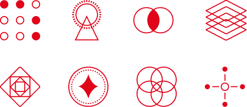
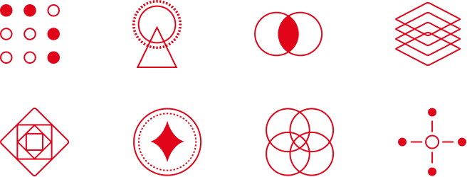
Abstract Icons
Used primarily for small-scale applications and complex concepts. Minimal design maintains aesthetic appeal while conveying meaning effectively, especially when simplicity is preferred over representation.


Functional Icons
More illustrative and functional icons, using bolder strokes to ensure clarity and readability.
07
Applications
7a
Name Conventions
Clear and consistent naming ensures brand alignment across all partner materials.
Learn how to properly reference EFGH and its sub-brands. Use the following guide when communicating a partnership or product integration in writing.
EFGH
Ensure that all letters in the abbreviation are capitalized.
Embed Financial Group Holdings
Ensure that all letters of each word are capitalized.
ConnectSure™
Ensure that the C and S in Connectsure is capitalized, and includes the trademark symbol (™) at the end.
SMEsure™
Ensure that the SME in SMEsure is capitalized, and includes the trademark symbol (™) at the end.
GAT™
Ensure that all letters are capitalized, and includes the trademark symbol (™) at the end.
7b
Corporate Merchandise
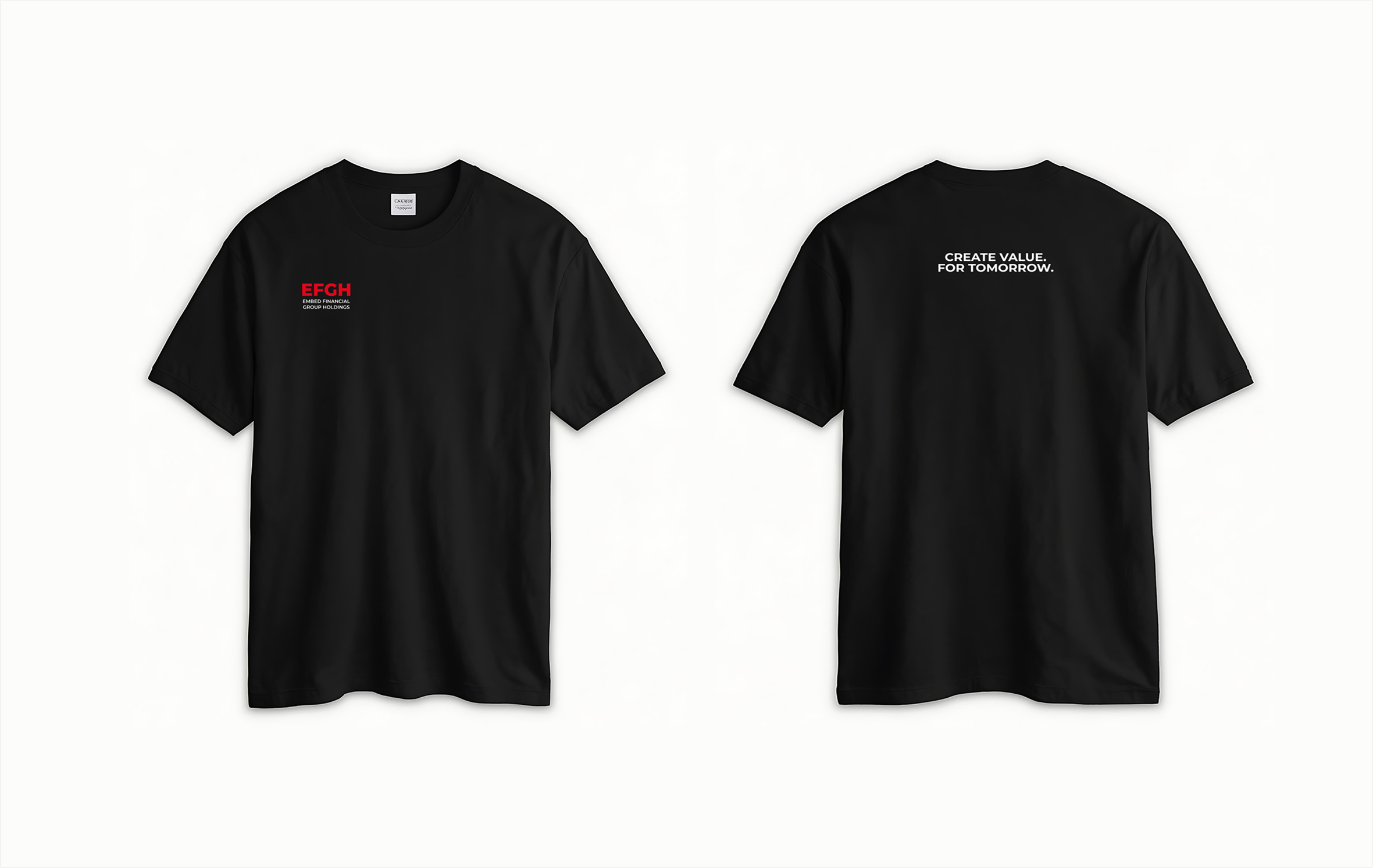
T-shirt
Lanyard
Name Card - Business Operations
Name Card - General Contact
Enamel Pin
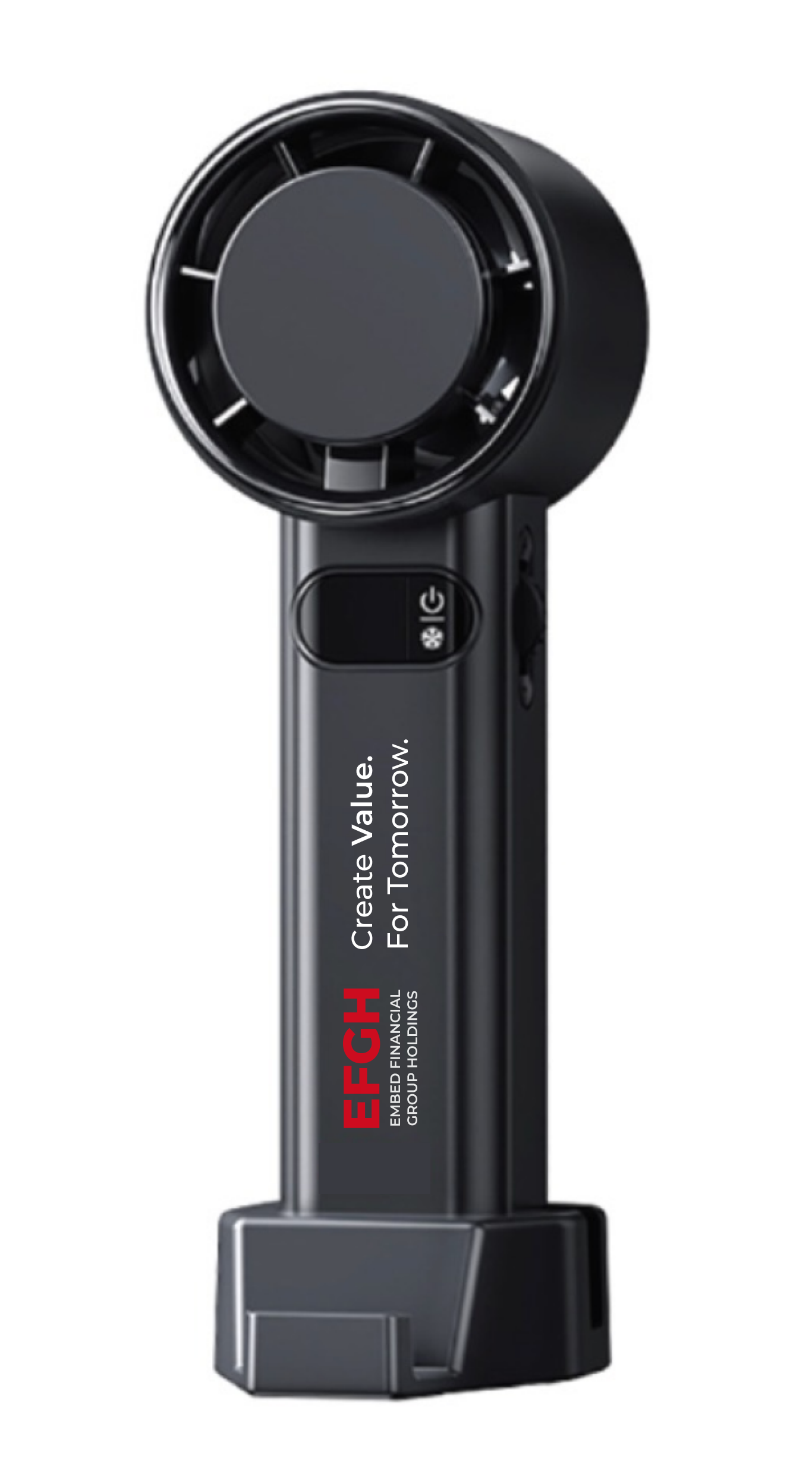
Fan
08
Summary
To summarize, these are the essential rules, best practices, and visual standards to help maintain the integrity of each brand.
These guidelines serves as a framework to ensure collaborative efforts are aligned, effective, and beneficial.
DOs
Use approved logo formats
Only use official, high-resolution logos provided by EFGH.
DOs
Maintain EFGH’s brand colors
Use EFGH’s official brand color variations and contrasts with the background.
DOs
Adhere to key naming conventions
Embed Financial Group Holdings (EFGH), SMEsure™, Connectsure™, GAT™.
DOs
Clearly state the nature of the partnership
Adjust logo prominance based on the type of co-branding/partnership.
DON’Ts
Don’t change the format or colors of the EFGH’s logo
Altering the logo format or colors will distort the brand identity.
DON’Ts
Don’t place logos on busy or low-contrast backgrounds
This makes logos difficult to see or read properly.
DON’Ts
Don’t use words or taglines that have not been approved by EFGH
Use the official typeface and approved taglines by EFGH.
DON’Ts
Don’t assume equal logo sizes for all partners
Only use equal sizing for co-branding/partnerships.


This is the EFGH Visual Brand Guideline.
It lays out how we show up in the world — from our logo and typography to our color palette, layout, and imagery. It defines the look and feel that makes us instantly recognizable and unmistakably us.
This guide is here to help anyone creating for our brand — whether you’re designing a social post, a website, or a pitch deck. It ensures everything looks consistent, intentional, and on-brand, no matter where or how it's seen.
So whether you're part of the team or a creative partner — welcome. Let’s make great things together. Dive right in.
Table of
Content
01
About EFGH
02
Personality
03
Logo Usage
04
Color Palette
05
Typography
06
Visuals
07
Application
01
About EFGH
Mission
To support the underinsured and underprivileged— what we call “the man on the street”
— by building systems that unlock long-term value at scale.
Whether through embedded protection, accessible credit, or better digital infrastructure, our mission is to make economic empowerment part of the everyday journey.
Our Philosophy
We’re not a solution. We’re a Value Creation Platform.
Value shouldn’t be a bonus — it should be built in.
We believe that truly scalable impact comes from embedding value into every touchpoint: onboarding, transactions, operations, and ecosystems.
EFGH exists to help partners do just that. Not through one-off tools or short-term campaigns, but by designing cohesive systems that support growth, inclusion, and retention — across platforms, products, and people.
Our Northstar
Create Value. For Tomorrow.
“Create Value” means we focus on outcomes: protection, access, revenue, retention. Real gains, not vanity metrics.
“For Tomorrow” reflects our commitment to long-term impact — especially in markets where infrastructure is still emerging and inclusion is still uneven.
We build for sustainability, not just scale. We create value that lasts.
02
Personality
Just like people, brands have personalities. Ours? Confident but approachable. Purposeful, but never preachy. Bold when needed, calm when it counts.
This guide helps everyone channel the same spirit — whether you're designing a page, crafting a headline, or briefing a team. Because consistency isn’t about being rigid — it’s about being unmistakably us.
Confident
Purposeful
Approachable
2a
Tone of Voice
Clear, Not Cold
We speak with clarity and direction, but never sound robotic or distant. Our tone is assertive, concise, and structured — yet always warm and human. This balance reflects our confidence in what we do while keeping our message accessible and relatable. Use this tone when giving instructions, writing headlines, or sharing important updates.
“ConnectSure™ is our embedded insurance system — designed to help insurers and platforms deliver protection without friction.”
✓ Why it works:
It’s clear, to the point, and easy to understand. It explains what the product is and how it helps — no fluff, no jargon.
“Our embedded insurance module is engineered with middleware architecture to deliver compliance-driven, modular, omnichannel protection across partner ecosystems.”
❌ Why it doesn’t work:
It's overloaded with technical buzzwords that confuse rather than clarify. The message gets lost in complexity, sounding distant and overly technical — not approachable or purposeful.
Friendly, Never Fluffy
We keep it conversational and engaging, but always with substance. Our voice is genuine and approachable, with just the right amount of charm — never overly casual or forced.
This tone helps us build trust with small businesses and partners who value authenticity. It’s perfect for user engagement, social media, or simplifying complex ideas.
“Use one tool or combine them into a system — everything we build is designed to scale with your needs.”
✓ Why it works:
It's friendly, flexible, and focused on the user. It encourages without overselling. You get a sense that EFGH is here to support, not overwhelm.
“Integrate disparate product stacks in a modularized ecosystem to maximize resilience and operational throughput across stakeholders.”
❌ Why it doesn’t work:
This sounds like corporate jargon for the sake of sounding smart. Phrases like "resilience and operational throughput" don’t connect emotionally or practically with real users. It feels impersonal and unclear.
Focused, With Heart
We communicate with intention and care — everything we say has a purpose. Our tone feels mission-driven and grounded, without being preachy or self-important.
It reflects our drive to make a meaningful impact while respecting our audience’s time and attention. Use this tone when discussing our mission, sharing values, or introducing new initiatives.
“EFGH exists for one reason: to enable growth in markets that are anything but simple.”
✓ Why it works:
It communicates purpose with clarity and humility. There’s heart behind the message, and it reflects EFGH’s mission in a grounded, authentic way.
“We are deploying innovative infra-led frameworks to catalyze regional insurance penetration through targeted distribution in complex emerging markets.”
❌ Why it doesn’t work:
While technically accurate, it sounds corporate and detached. It overuses complex, formal language that obscures meaning and feels self-important — losing the human, purposeful tone EFGH aims for.
03
Logo Usage
This section provides clear rules on how to apply the EFGH logo across digital and print materials. For consistency and brand integrity, all final usage must be reviewed and approved by the creative or marketing team before any public release.
3a
Master Logo

3b
Clearspace
Primary Logo - Red Logo on white background
Reverse Logo - White Logo on red background
Secondary Logo on black background: Version 1
Secondary Logo on black background: Version 2
Greyscale Logo on black background.*Only use this if we are placing EFGH logo together with other greyscale logos.
Greyscale Logo on white background.
*Only use this if we are placing EFGH logo together with other greyscale logos.


The EFGH symbol is adapted into a simplified badge for use as a favicon, app icon, or social media profile image. This ensures the brand remains recognizable and consistent, even at small sizes or in digital spaces where the full logo isn’t practical. Our symbol is also designed to fit into different shapes, whether it be a circle or square.
3e
Incorrect Logo Usage

Do not add gradient

Do not stretch

Do not change color

Do not rotate

Do not use on busy background

Do not add effects

Do not apply outline

Do not recreate/
retype words
Co-branding
Lockups
When we show up alongside our partners, clarity and balance are key. Our logo should sit confidently, with equal respect given to our partners. Use this guide to maintain a consistent, professional presentation across all co-branded materials — especially decks, press kits, landing pages, and digital banners.
HORIZONTAL

VERTICAL
When we show up alongside our partners, clarity and balance are key. Our logo should sit confidently, with equal respect given to our partners. Use this guide to maintain a consistent, professional presentation across all co-branded materials — especially decks, press kits, landing pages, and digital banners.
✓ Equal Prominence
EFGH and partner logos must be treated with visual balance — neither should overshadow the other. Match logo sizes proportionally (based on visual weight, not just pixel width) and align them horizontally unless context calls for vertical stacking.
✓ Placement
Place logos side by side, with EFGH typically leading (left-aligned or top-aligned), unless the partner is the primary host or owner of the asset. Maintain even spacing between logos, following clear space rules for both brands.
✓ Clear Space
Maintain sufficient padding around each logo. At a minimum, use the height of the E in the EFGH logo as the clear space buffer on all sides — and ensure partner logos follow their respective brand guidelines.
✓ Background Control
Use logos only on solid or neutral backgrounds that maintain legibility and contrast. Avoid placing logos over busy imagery or gradients unless cleared by the EFGH creative team.
✓ File Types & Quality
Use vector or high-resolution PNG versions of all logos. Avoid stretching, pixelation, or any distortion. Never alter the color, aspect ratio, or orientation of either logo.
✓ Approval Required
All partnership presentations featuring the EFGH logo must be reviewed by our creative or marketing team prior to any external release. This includes press materials, investor decks, joint campaigns, and digital collateral.
3f
Logo Placement
EFGH partnerships follow three main execution approaches —some more frequently used than others. Each is crafted to achieve a clear objective while upholding the integrity of the EFGH brand.


Title Partners or Co-organizers
Side-by-side placement to show an equal partnership.
Supported by

Supporting Partner or Title Sponsors
Shows how one partner supports another.
Supported by

Multiple Brand Inclusion
Side-by-side placement to show an equal partnership.
3g
Incorrect Co-branding


Too close in space


Unequal sizing


Changing logo colors


Busy or low contrast backgrounds
Merging different logos
exists to help partners do just that. Not through one-off tools or short-term campaigns, by designing cohesive systems

Use in a sentence or body copy
Credit Line
This section provides guidelines for using EFGH in credit lines. Use the width of the E in the EFGH logo as the clear space buffer on all sides. Any new usage or adaptation of sub-brand logos must be reviewed and approved by the creative or marketing team before going live.
HORIZONTAL
Supported by


VERTICAL
Supported by


Multiple Brand Inclusions
Supported by


Sub-brand Logo
This section outlines how to use sub-brand logos consistently and clearly. Any new usage or adaptation of sub-brand logos must be reviewed and approved by the creative or marketing team before going live.
DOWNLOAD

ConnectSureTM Logo


SMEsureTM Logo

GATTM Logo

ConnectSureTM Logo - Reversed- Only on Black Background


SMEsureTM Logo - Reversed- Only on SMEsureTM Brand Red Background

GATTM Logo - Reversed- Only on Black Background
04
Color Palette
This section outlines how to use sub-brand logos consistently and clearly. Any new usage or adaptation of sub-brand logos must be reviewed and approved by the creative or marketing team before going live.
5a
Primary Palette
Red
Hex: #E1051A
RGB: rgb(225 5 26)
White
Hex: #FFFFFF
RGB: rgb(255 255 255)
Black
Hex: #090B0E
RGB: rgb(9 11 14)
5b
Secondary Palette
Dark Grey
Hex: #626262
RGB: rgb(98 98 98)
Grey
Hex: #DDDDDD
RGB: rgb(221 221 221)
Light Grey
Hex: #EFEFEF
RGB: rgb(239 239 239)
SMEsureTM Red
Hex: #9E051C
RGB: rgb(158 5 28)
5c
Gradient Palette
Light Grey Gradient
Beige Gradient
Red Gradient
05
Typography
Typography plays a key role in shaping how people experience the EFGH brand. This section outlines our typefaces, hierarchy, and usage rules to ensure every word looks as intentional as it sounds.
Use this guide to keep our communications consistent and polished.
Montserrat
Primary Sans-Serif (Montserrat Medium)
Montserrat Medium
Aa Bb Cc Dd Ee Ff Gg Hh Ii Jj Kk Ll Mm Nn Oo Pp Qq Rr Ss Tt Uu Vv Ww Xx Yy Zz 1234567890 !@#$%^&*()
Montserrat Semibold
Aa Bb Cc Dd Ee Ff Gg Hh Ii Jj Kk Ll Mm Nn Oo Pp Qq Rr Ss Tt Uu Vv Ww Xx Yy Zz 1234567890 !@#$%^&*()
5a
Sizing
Heading 1: Montserrat Semibold, 40px
Create Value. For Tomorrow.
Heading 2: Montserrat Semibold, 32px
Embedded Insurance Infrastructure
Heading 3: Montserrat Semibold, 24px
Connectsure
Heading 4: Montserrat Semibold, 20px
Our Solutions
Body Text Regular: Montserrat Medium, 16px
Value shouldn't be a bonus — it should be built in. We believe that truly scalable impact comes from embedding value into every touchpoint: onboarding, transactions, operations, and ecosystems.
Body Text Medium: Montserrat Medium, 14px
Leave a message
Body Text Small: Montserrat Medium, 10px
Insights
Button/Link Text: Montserrat Medium, 18px
Let’s Connect
5b
Variables
For headings on light backgrounds, apply the brand red to highlighted text for added contrast and clarity.To emphasize specific words or phrases, use Sans-serif (Montserrat Semibold) at the same type size.
How Our Platform Works
Variable usage example 1
Create Value. For Tomorrow.
Variable usage example 2
5c
Fallback Font
To ensure visual consistency, a fallback font is provided as an alternative. Use Sans-serif (Calibri Regular) when the primary EFGH font isn’t available—especially in shared slides or platforms that don’t support custom fonts.
Calibri
Fallback Sans-Serif (Calibri Regular)
Calibri Regular
Aa Bb Cc Dd Ee Ff Gg Hh Ii Jj Kk Ll Mm Nn Oo Pp Qq Rr Ss Tt Uu Vv Ww Xx Yy Zz 1234567890
!@#$%^&*()
Calibri Bold
Aa Bb Cc Dd Ee Ff Gg Hh Ii Jj Kk Ll Mm Nn Oo Pp Qq Rr Ss Tt Uu Vv Ww Xx Yy Zz 1234567890
!@#$%^&*()
06
Visuals
6a
Illustrations


Abstract Stroke Art
Illustrations should use thin linework combined with flat colors from the core brand palette (red, white, and black). Avoid gradients, shading, or unnecessary effects. The style should remain minimal and clean.
Informative Diagrams
Use simplified, flat-style illustrations with supporting text boxes to communicate concepts clearly. Ideal for explaining workflows, processes, or system components.


Narrative Illustration
Use corporate-style illustrations with flat color fills, consistent linework, and EFGH’s primary color palette. Avoid facial features; focus on dynamic poses and clear, purposeful composition. This illustration style are mostly used for social media.
Mixed Media Imagery
Combine real imagery with clean graphic elements to convey information in a human, engaging way. Use visual components to guide viewer attention and add context to the imagery.
6b
Imagery
Balanced & Clean
Photography should have a well-balanced composition, with clear visual on the main object. Content of imagery should be related to EFGH (insurance, business, protection, finance, partnership, teamwork, etc)
Link
Subtle Technology Integration
Photography should include elements of modern technology—computer screens, tablets with data analytics, mobile phone, or other communication/business tools.
Link
Represent Diversity
Imagery should reflect the diverse communities EFGH serves, with a focus on authentic representation of people across Africa and Asia. Showcase inclusive, modern professionals in real business settings.
Link
People with Confidence & Focus
Images should capture real-world scenarios—professionals analyzing reports and teams discussing strategies. This reinforces EFGH’s role in improving businesses using embed insurance.
Link
6c
Graphic Elements
Ellipse Pattern (Radial) - USED IN WEBSITE PAGE HERO
A subtle radial pattern of ellipses is used on light backgrounds. Opacity increases gradually as the pattern expands outward. Ellipses may also be arranged in alternative layouts such as spirals or waves to complement different compositions.


Abstract Patterns - USED IN WEBSITE CTA BANNERS
Abstract pattern is used on black backgrounds. Opacity can be adjusted to fit the design subtlely , but it shall not be
6d
Iconography
Abstract Icons
Used primarily for small-scale applications and complex concepts. Minimal design maintains aesthetic appeal while conveying meaning effectively, especially when simplicity is preferred over representation.


Functional Icons
More illustrative and functional icons, using bolder strokes to ensure clarity and readability.
07
Applications
7a
Name Conventions
Clear and consistent naming ensures brand alignment across all partner materials.
Learn how to properly reference EFGH and its sub-brands. Use the following guide when communicating a partnership or product integration in writing.
EFGH
Ensure that all letters in the abbreviation are capitalized.
Embed Financial Group Holdings
Ensure that all letters of each word are capitalized.
ConnectSure™
Ensure that the C and S in Connectsure is capitalized, and includes the trademark symbol (™) at the end.
SMEsure™
Ensure that the SME in SMEsure is capitalized, and includes the trademark symbol (™) at the end.
GAT™
Ensure that all letters are capitalized, and includes the trademark symbol (™) at the end.
7b
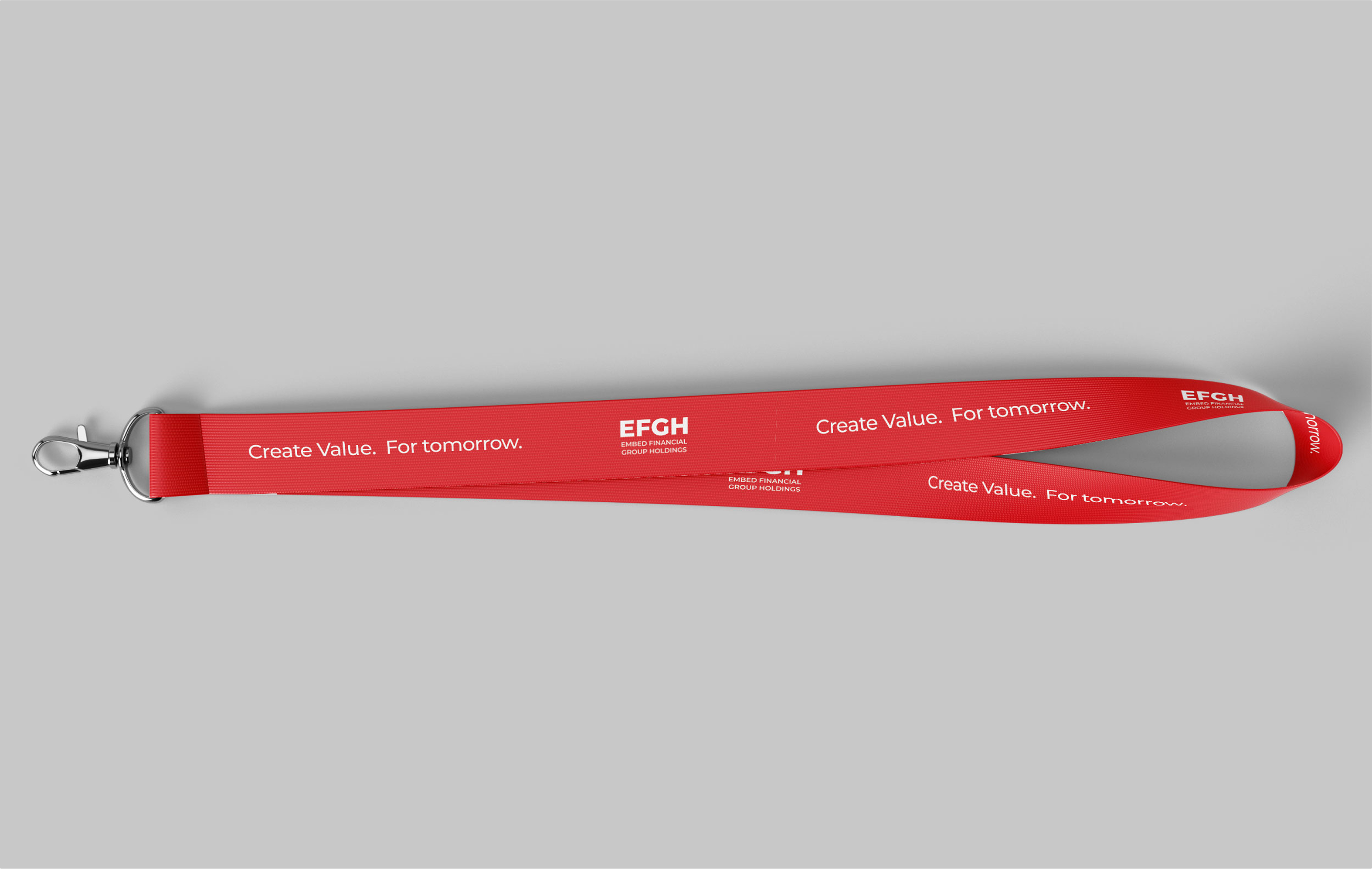
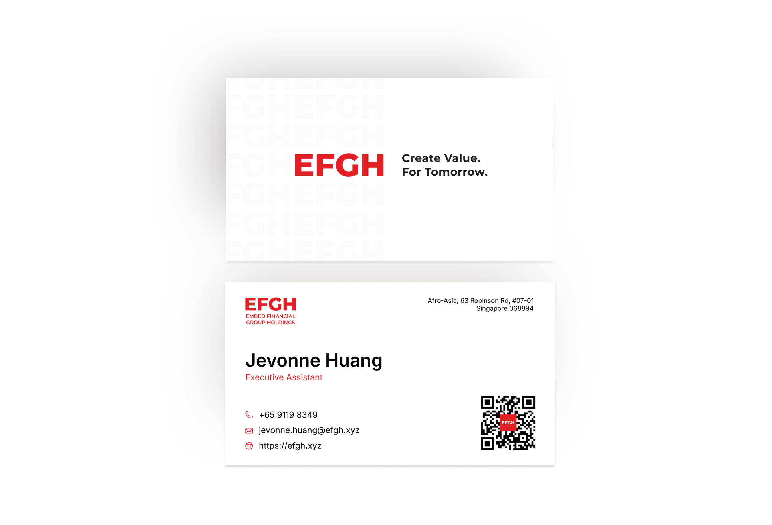
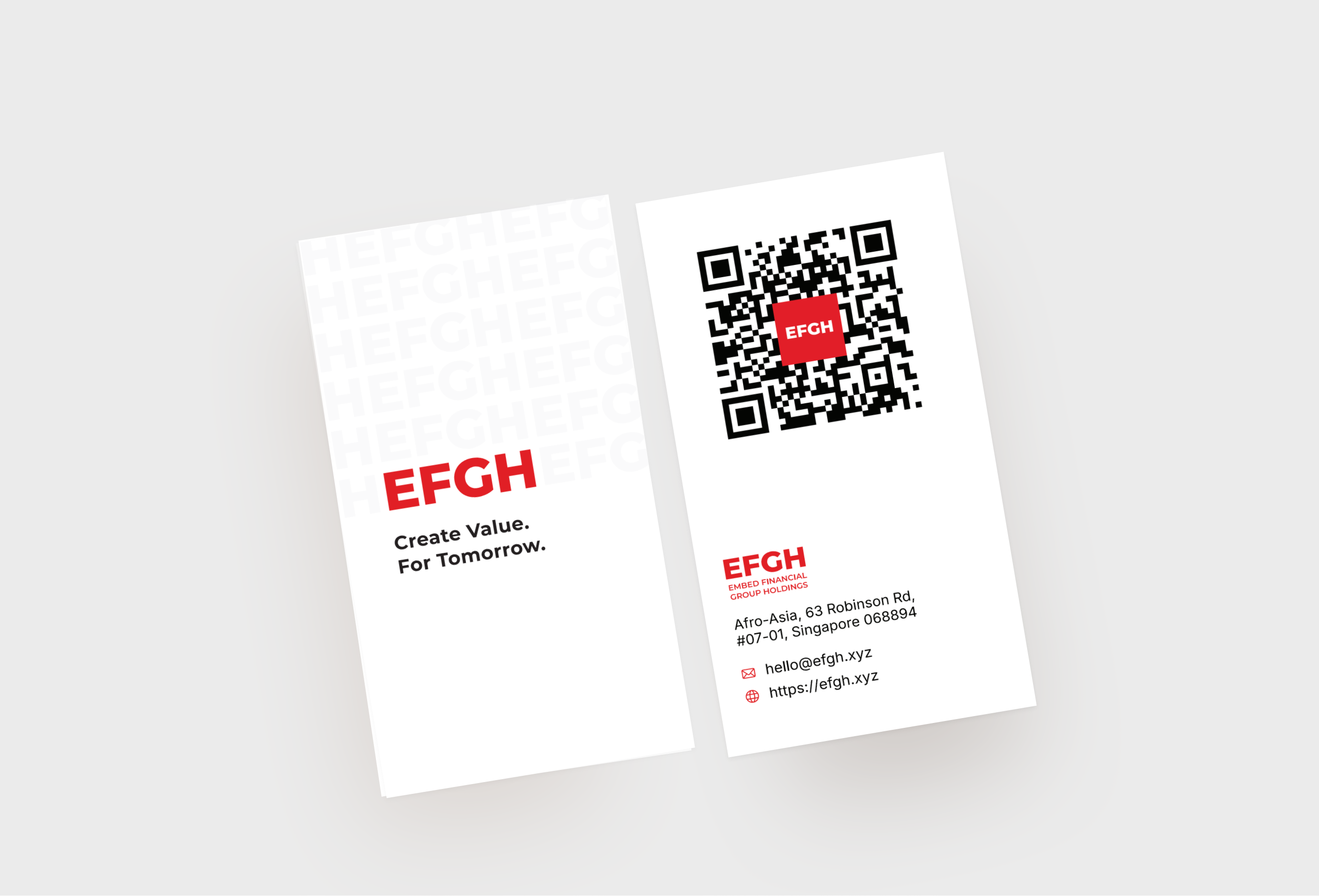
Corporate Merchandise
T-shirt
Lanyard
Name Card - Business Operations
Name Card - General Contact
Enamel Pin
Fan
08
Summary
To summarize, these are the essential rules, best practices, and visual standards to help maintain the integrity of each brand.
These guidelines serves as a framework to ensure collaborative efforts are aligned, effective, and beneficial.
DOs
Use approved logo formats
Only use official, high-resolution logos provided by EFGH.
DOs
Maintain EFGH’s brand colors
Use EFGH’s official brand color variations and contrasts with the background.
DOs
Adhere to key naming conventions
Embed Financial Group Holdings (EFGH), SMEsure™, Connectsure™, GAT™.
DOs
Clearly state the nature of the partnership
Adjust logo prominance based on the type of co-branding/partnership.
DON’Ts
Don’t change the format or colors of the EFGH’s logo
Altering the logo format or colors will distort the brand identity.
DON’Ts
Don’t place logos on busy or low-contrast backgrounds
This makes logos difficult to see or read properly.
DON’Ts
Don’t use words or taglines that have not been approved by EFGH
Use the official typeface and approved taglines by EFGH.
DON’Ts
Don’t assume equal logo sizes for all partners
Only use equal sizing for co-branding/partnerships.


This is the EFGH Visual Brand Guideline.
It lays out how we show up in the world — from our logo and typography to our color palette, layout, and imagery. It defines the look and feel that makes us instantly recognizable and unmistakably us.
This guide is here to help anyone creating for our brand — whether you’re designing a social post, a website, or a pitch deck. It ensures everything looks consistent, intentional, and on-brand, no matter where or how it's seen.
So whether you're part of the team or a creative partner — welcome. Let’s make great things together. Dive right in.
Table of
Content
01
About EFGH
02
Personality
03
Logo Usage
04
Color Palette
05
Typography
06
Visuals
07
Application
01
About EFGH
Mission
To support the underinsured and underprivileged— what we call “the man on the street”
— by building systems that unlock long-term value at scale.
Whether through embedded protection, accessible credit, or better digital infrastructure, our mission is to make economic empowerment part of the everyday journey.
Our Philosophy
We’re not a solution. We’re a Value Creation Platform.
Value shouldn’t be a bonus — it should be built in.
We believe that truly scalable impact comes from embedding value into every touchpoint: onboarding, transactions, operations, and ecosystems.
EFGH exists to help partners do just that. Not through one-off tools or short-term campaigns, but by designing cohesive systems that support growth, inclusion, and retention — across platforms, products, and people.
Our Northstar
Create Value. For Tomorrow.
“Create Value” means we focus on outcomes: protection, access, revenue, retention. Real gains, not vanity metrics.
“For Tomorrow” reflects our commitment to long-term impact — especially in markets where infrastructure is still emerging and inclusion is still uneven.
We build for sustainability, not just scale. We create value that lasts.
02
Personality
Just like people, brands have personalities. Ours? Confident but approachable. Purposeful, but never preachy. Bold when needed, calm when it counts.
This guide helps everyone channel the same spirit — whether you're designing a page, crafting a headline, or briefing a team. Because consistency isn’t about being rigid — it’s about being unmistakably us.
Confident
Purposeful
Approachable
2a
Tone of Voice
Clear, Not Cold
We speak with clarity and direction, but never sound robotic or distant. Our tone is assertive, concise, and structured — yet always warm and human. This balance reflects our confidence in what we do while keeping our message accessible and relatable. Use this tone when giving instructions, writing headlines, or sharing important updates.
“ConnectSure™ is our embedded insurance system — designed to help insurers and platforms deliver protection without friction.”
✓ Why it works:
It’s clear, to the point, and easy to understand. It explains what the product is and how it helps — no fluff, no jargon.
“Our embedded insurance module is engineered with middleware architecture to deliver compliance-driven, modular, omnichannel protection across partner ecosystems.”
❌ Why it doesn’t work:
It's overloaded with technical buzzwords that confuse rather than clarify. The message gets lost in complexity, sounding distant and overly technical — not approachable or purposeful.
Friendly, Never Fluffy
We keep it conversational and engaging, but always with substance. Our voice is genuine and approachable, with just the right amount of charm — never overly casual or forced.
This tone helps us build trust with small businesses and partners who value authenticity. It’s perfect for user engagement, social media, or simplifying complex ideas.
“Use one tool or combine them into a system — everything we build is designed to scale with your needs.”
✓ Why it works:
It's friendly, flexible, and focused on the user. It encourages without overselling. You get a sense that EFGH is here to support, not overwhelm.
“Integrate disparate product stacks in a modularized ecosystem to maximize resilience and operational throughput across stakeholders.”
❌ Why it doesn’t work:
This sounds like corporate jargon for the sake of sounding smart. Phrases like "resilience and operational throughput" don’t connect emotionally or practically with real users. It feels impersonal and unclear.
Focused, With Heart
We communicate with intention and care — everything we say has a purpose. Our tone feels mission-driven and grounded, without being preachy or self-important.
It reflects our drive to make a meaningful impact while respecting our audience’s time and attention. Use this tone when discussing our mission, sharing values, or introducing new initiatives.
“EFGH exists for one reason: to enable growth in markets that are anything but simple.”
✓ Why it works:
It communicates purpose with clarity and humility. There’s heart behind the message, and it reflects EFGH’s mission in a grounded, authentic way.
“We are deploying innovative infra-led frameworks to catalyze regional insurance penetration through targeted distribution in complex emerging markets.”
❌ Why it doesn’t work:
While technically accurate, it sounds corporate and detached. It overuses complex, formal language that obscures meaning and feels self-important — losing the human, purposeful tone EFGH aims for.
03
Logo Usage
This section provides clear rules on how to apply the EFGH logo across digital and print materials. For consistency and brand integrity, all final usage must be reviewed and approved by the creative or marketing team before any public release.
3a
Master Logo

3b
Clearspace

Primary Logo - Red Logo on white background

Reverse Logo - White Logo on red background
Secondary Logo on black background: Version 1

Secondary Logo on black background: Version 2

Greyscale Logo on black background.*Only use this if we are placing EFGH logo together with other greyscale logos.

Greyscale Logo on white background.
*Only use this if we are placing EFGH logo together with other greyscale logos.


The EFGH symbol is adapted into a simplified badge for use as a favicon, app icon, or social media profile image. This ensures the brand remains recognizable and consistent, even at small sizes or in digital spaces where the full logo isn’t practical. Our symbol is also designed to fit into different shapes, whether it be a circle or square.
3e
Incorrect Logo Usage

Do not add gradient

Do not stretch

Do not change color

Do not rotate

Do not use on busy background

Do not add effects

Do not apply outline

Do not recreate/retype words
Co-branding
Lockups
When we show up alongside our partners, clarity and balance are key. Our logo should sit confidently, with equal respect given to our partners. Use this guide to maintain a consistent, professional presentation across all co-branded materials — especially decks, press kits, landing pages, and digital banners.
HORIZONTAL
VERTICAL
When we show up alongside our partners, clarity and balance are key. Our logo should sit confidently, with equal respect given to our partners. Use this guide to maintain a consistent, professional presentation across all co-branded materials — especially decks, press kits, landing pages, and digital banners.
✓ Equal Prominence
EFGH and partner logos must be treated with visual balance — neither should overshadow the other. Match logo sizes proportionally (based on visual weight, not just pixel width) and align them horizontally unless context calls for vertical stacking.
✓ Placement
Place logos side by side, with EFGH typically leading (left-aligned or top-aligned), unless the partner is the primary host or owner of the asset. Maintain even spacing between logos, following clear space rules for both brands.
✓ Clear Space
Maintain sufficient padding around each logo. At a minimum, use the height of the E in the EFGH logo as the clear space buffer on all sides — and ensure partner logos follow their respective brand guidelines.
✓ Background Control
Use logos only on solid or neutral backgrounds that maintain legibility and contrast. Avoid placing logos over busy imagery or gradients unless cleared by the EFGH creative team.
✓ File Types & Quality
Use vector or high-resolution PNG versions of all logos. Avoid stretching, pixelation, or any distortion. Never alter the color, aspect ratio, or orientation of either logo.
✓ Approval Required
All partnership presentations featuring the EFGH logo must be reviewed by our creative or marketing team prior to any external release. This includes press materials, investor decks, joint campaigns, and digital collateral.
3f
Logo Placement
EFGH partnerships follow three main execution approaches —some more frequently used than others. Each is crafted to achieve a clear objective while upholding the integrity of the EFGH brand.
Title Partners or Co-organizers
Side-by-side placement to show an equal partnership.
Supported by
Supporting Partner or Title Sponsors
Shows how one partner supports another.
Supported by
Multiple Brand Inclusion
Side-by-side placement to show an equal partnership.
3g
Incorrect Co-branding
Too close in space
Unequal sizing
Changing logo colors
Busy or low contrast backgrounds
Merging different logos
exists to help partners do just that. Not through one-off tools or short-term campaigns, by designing cohesive systems

Use in a sentence or body copy
Credit Line
This section provides guidelines for using EFGH in credit lines. Use the width of the E in the EFGH logo as the clear space buffer on all sides. Any new usage or adaptation of sub-brand logos must be reviewed and approved by the creative or marketing team before going live.
HORIZONTAL
Supported by


VERTICAL
Supported by


Multiple Brand Inclusions
Supported by


Sub-brand Logo
This section outlines how to use sub-brand logos consistently and clearly. Any new usage or adaptation of sub-brand logos must be reviewed and approved by the creative or marketing team before going live.
DOWNLOAD

ConnectSureTM Logo


SMEsureTM Logo

GATTM Logo

ConnectSureTM Logo - Reversed- Only on Black Background


SMEsureTM Logo - Reversed- Only on SMEsureTM Brand Red Background

GATTM Logo - Reversed- Only on Black Background
04
Color Palette
This section outlines how to use sub-brand logos consistently and clearly. Any new usage or adaptation of sub-brand logos must be reviewed and approved by the creative or marketing team before going live.
5a
Primary Palette
Red
Hex: #E1051A
RGB: rgb(225 5 26)
White
Hex: #FFFFFF
RGB: rgb(255 255 255)
Black
Hex: #090B0E
RGB: rgb(9 11 14)
5b
Secondary Palette
Dark Grey
Hex: #626262
RGB: rgb(98 98 98)
Grey
Hex: #DDDDDD
RGB: rgb(221 221 221)
Light Grey
Hex: #EFEFEF
RGB: rgb(239 239 239)
SMEsureTM Red
Hex: #9E051C
RGB: rgb(158 5 28)
5c
Gradient Palette
Light Grey Gradient
Beige Gradient
Red Gradient
05
Typography
Typography plays a key role in shaping how people experience the EFGH brand. This section outlines our typefaces, hierarchy, and usage rules to ensure every word looks as intentional as it sounds.
Use this guide to keep our communications consistent and polished.
Montserrat
Primary Sans-Serif (Montserrat Medium)
Montserrat Medium
Aa Bb Cc Dd Ee Ff Gg Hh Ii Jj Kk Ll Mm Nn Oo Pp Qq Rr Ss Tt Uu Vv Ww Xx Yy Zz 1234567890 !@#$%^&*()
Montserrat Semibold
Aa Bb Cc Dd Ee Ff Gg Hh Ii Jj Kk Ll Mm Nn Oo Pp Qq Rr Ss Tt Uu Vv Ww Xx Yy Zz 1234567890 !@#$%^&*()
5a
Sizing
Heading 1: Montserrat Semibold, 40px
Create Value. For Tomorrow.
Heading 2: Montserrat Semibold, 32px
Embedded Insurance Infrastructure
Heading 3: Montserrat Semibold, 24px
Connectsure
Heading 4: Montserrat Semibold, 20px
Our Solutions
Body Text Regular: Montserrat Medium, 16px
Value shouldn't be a bonus — it should be built in. We believe that truly scalable impact comes from embedding value into every touchpoint: onboarding, transactions, operations, and ecosystems.
Body Text Medium: Montserrat Medium, 14px
Leave a message
Body Text Small: Montserrat Medium, 10px
Insights
Button/Link Text: Montserrat Medium, 18px
Let’s Connect
5b
Variables
For headings on light backgrounds, apply the brand red to highlighted text for added contrast and clarity.To emphasize specific words or phrases, use Sans-serif (Montserrat Semibold) at the same type size.
How Our Platform Works
Variable usage example 1
Create Value. For Tomorrow.
Variable usage example 2
5c
Fallback Font
To ensure visual consistency, a fallback font is provided as an alternative. Use Sans-serif (Calibri Regular) when the primary EFGH font isn’t available—especially in shared slides or platforms that don’t support custom fonts.
Calibri
Fallback Sans-Serif (Calibri Regular)
Calibri Regular
Aa Bb Cc Dd Ee Ff Gg Hh Ii Jj Kk Ll Mm Nn Oo Pp Qq Rr Ss Tt Uu Vv Ww Xx Yy Zz 1234567890 !@#$%^&*()
Calibri Bold
Aa Bb Cc Dd Ee Ff Gg Hh Ii Jj Kk Ll Mm Nn Oo Pp Qq Rr Ss Tt Uu Vv Ww Xx Yy Zz 1234567890 !@#$%^&*()
06
Visuals
6a
Illustrations


Abstract Stroke Art
Illustrations should use thin linework combined with flat colors from the core brand palette (red, white, and black). Avoid gradients, shading, or unnecessary effects. The style should remain minimal and clean.
Informative Diagrams
Use simplified, flat-style illustrations with supporting text boxes to communicate concepts clearly. Ideal for explaining workflows, processes, or system components.


Narrative Illustration
Use corporate-style illustrations with flat color fills, consistent linework, and EFGH’s primary color palette. Avoid facial features; focus on dynamic poses and clear, purposeful composition. This illustration style are mostly used for social media.
Mixed Media Imagery
Combine real imagery with clean graphic elements to convey information in a human, engaging way. Use visual components to guide viewer attention and add context to the imagery.
6b
Imagery
Balanced & Clean
Photography should have a well-balanced composition, with clear visual on the main object. Content of imagery should be related to EFGH (insurance, business, protection, finance, partnership, teamwork, etc)
Link
Subtle Technology Integration
Photography should include elements of modern technology—computer screens, tablets with data analytics, mobile phone, or other communication/business tools.
Link
Represent Diversity
Imagery should reflect the diverse communities EFGH serves, with a focus on authentic representation of people across Africa and Asia. Showcase inclusive, modern professionals in real business settings.
Link
People with Confidence & Focus
Images should capture real-world scenarios—professionals analyzing reports and teams discussing strategies. This reinforces EFGH’s role in improving businesses using embed insurance.
Link
6c
Graphic Elements
Ellipse Pattern (Radial) - USED IN WEBSITE PAGE HERO
A subtle radial pattern of ellipses is used on light backgrounds. Opacity increases gradually as the pattern expands outward. Ellipses may also be arranged in alternative layouts such as spirals or waves to complement different compositions.


Abstract Patterns - USED IN WEBSITE CTA BANNERS
Abstract pattern is used on black backgrounds. Opacity can be adjusted to fit the design subtlety.
6d
Iconography
Abstract Icons
Used primarily for small-scale applications and complex concepts. Minimal design maintains aesthetic appeal while conveying meaning effectively, especially when simplicity is preferred over representation.


Functional Icons
More illustrative and functional icons, using bolder strokes to ensure clarity and readability.
07
Applications
7a
Name Conventions
Clear and consistent naming ensures brand alignment across all partner materials.
Learn how to properly reference EFGH and its sub-brands. Use the following guide when communicating a partnership or product integration in writing.
EFGH
Ensure that all letters in the abbreviation are capitalized.
Embed Financial Group Holdings
Ensure that all letters of each word are capitalized.
ConnectSure™
Ensure that the C and S in Connectsure is capitalized, and includes the trademark symbol (™) at the end.
SMEsure™
Ensure that the SME in SMEsure is capitalized, and includes the trademark symbol (™) at the end.
GAT™
Ensure that all letters are capitalized, and includes the trademark symbol (™) at the end.
7b
Corporate Merchandise
T-shirt
Lanyard
Name Card - Business Operations
Name Card - General Contact
Enamel Pin
Fan
08
Summary
To summarize, these are the essential rules, best practices, and visual standards to help maintain the integrity of each brand.
These guidelines serves as a framework to ensure collaborative efforts are aligned, effective, and beneficial.
DOs
Use approved logo formats
Only use official, high-resolution logos provided by EFGH.
DOs
Maintain EFGH’s brand colors
Use EFGH’s official brand color variations and contrasts with the background.
DOs
Adhere to key naming conventions
Embed Financial Group Holdings (EFGH), SMEsure™, Connectsure™, GAT™.
DOs
Clearly state the nature of the partnership
Adjust logo prominance based on the type of co-branding/partnership.
DON’Ts
Don’t change the format or colors of the EFGH’s logo
Altering the logo format or colors will distort the brand identity.
DON’Ts
Don’t place logos on busy or low-contrast backgrounds
This makes logos difficult to see or read properly.
DON’Ts
Don’t use words or taglines that have not been approved by EFGH
Use the official typeface and approved taglines by EFGH.
DON’Ts
Don’t assume equal logo sizes for all partners
Only use equal sizing for co-branding/partnerships.
This is the EFGH Visual Brand Guideline.
It lays out how we show up in the world — from our logo and typography to our color palette, layout, and imagery. It defines the look and feel that makes us instantly recognizable and unmistakably us.
This guide is here to help anyone creating for our brand — whether you’re designing a social post, a website, or a pitch deck. It ensures everything looks consistent, intentional, and on-brand, no matter where or how it's seen.
So whether you're part of the team or a creative partner — welcome. Let’s make great things together. Dive right in.
Table of
Content
01
About EFGH
02
Personality
03
Logo Usage
04
Color Palette
05
Typography
06
Visuals
07
Application
01
About EFGH
Mission
To support the underinsured and underprivileged— what we call “the man on the street”
— by building systems that unlock long-term value at scale.
Whether through embedded protection, accessible credit, or better digital infrastructure, our mission is to make economic empowerment part of the everyday journey.
Our Philosophy
We’re not a solution. We’re a Value Creation Platform.
Value shouldn’t be a bonus — it should be built in.
We believe that truly scalable impact comes from embedding value into every touchpoint: onboarding, transactions, operations, and ecosystems.
EFGH exists to help partners do just that. Not through one-off tools or short-term campaigns, but by designing cohesive systems that support growth, inclusion, and retention — across platforms, products, and people.
Our Northstar
Create Value. For Tomorrow.
“Create Value” means we focus on outcomes: protection, access, revenue, retention. Real gains, not vanity metrics.
“For Tomorrow” reflects our commitment to long-term impact — especially in markets where infrastructure is still emerging and inclusion is still uneven.
We build for sustainability, not just scale. We create value that lasts.
02
Personality
Just like people, brands have personalities. Ours? Confident but approachable. Purposeful, but never preachy. Bold when needed, calm when it counts.
This guide helps everyone channel the same spirit — whether you're designing a page, crafting a headline, or briefing a team. Because consistency isn’t about being rigid — it’s about being unmistakably us.
Confident
Purposeful
Approachable


2a
Tone of Voice
Clear, Not Cold
We speak with clarity and direction, but never sound robotic or distant. Our tone is assertive, concise, and structured — yet always warm and human. This balance reflects our confidence in what we do while keeping our message accessible and relatable. Use this tone when giving instructions, writing headlines, or sharing important updates.
“ConnectSure™ is our embedded insurance system — designed to help insurers and platforms deliver protection without friction.”
✓ Why it works:
It’s clear, to the point, and easy to understand. It explains what the product is and how it helps — no fluff, no jargon.
“Our embedded insurance module is engineered with middleware architecture to deliver compliance-driven, modular, omnichannel protection across partner ecosystems.”
❌ Why it doesn’t work:
It's overloaded with technical buzzwords that confuse rather than clarify. The message gets lost in complexity, sounding distant and overly technical — not approachable or purposeful.
Friendly, Never Fluffy
We keep it conversational and engaging, but always with substance. Our voice is genuine and approachable, with just the right amount of charm — never overly casual or forced.
This tone helps us build trust with small businesses and partners who value authenticity. It’s perfect for user engagement, social media, or simplifying complex ideas.
“Use one tool or combine them into a system — everything we build is designed to scale with your needs.”
✓ Why it works:
It's friendly, flexible, and focused on the user. It encourages without overselling. You get a sense that EFGH is here to support, not overwhelm.
“Integrate disparate product stacks in a modularized ecosystem to maximize resilience and operational throughput across stakeholders.”
❌ Why it doesn’t work:
This sounds like corporate jargon for the sake of sounding smart. Phrases like "resilience and operational throughput" don’t connect emotionally or practically with real users. It feels impersonal and unclear.
Focused, With Heart
We communicate with intention and care — everything we say has a purpose. Our tone feels mission-driven and grounded, without being preachy or self-important.
It reflects our drive to make a meaningful impact while respecting our audience’s time and attention. Use this tone when discussing our mission, sharing values, or introducing new initiatives.
“EFGH exists for one reason: to enable growth in markets that are anything but simple.”
✓ Why it works:
It communicates purpose with clarity and humility. There’s heart behind the message, and it reflects EFGH’s mission in a grounded, authentic way.
“We are deploying innovative infra-led frameworks to catalyze regional insurance penetration through targeted distribution in complex emerging markets.”
❌ Why it doesn’t work:
While technically accurate, it sounds corporate and detached. It overuses complex, formal language that obscures meaning and feels self-important — losing the human, purposeful tone EFGH aims for.
03
Logo Usage
This section provides clear rules on how to apply the EFGH logo across digital and print materials. For consistency and brand integrity, all final usage must be reviewed and approved by the creative or marketing team before any public release.
3a
Master Logo

3b
Clearspace

Primary Logo - Red Logo on white background

Reverse Logo - White Logo on red background
Secondary Logo on black background: Version 1

Secondary Logo on black background: Version 2

Greyscale Logo on black background.*Only use this if we are placing EFGH logo together with other greyscale logos.

Greyscale Logo on white background.
*Only use this if we are placing EFGH logo together with other greyscale logos.


The EFGH symbol is adapted into a simplified badge for use as a favicon, app icon, or social media profile image. This ensures the brand remains recognizable and consistent, even at small sizes or in digital spaces where the full logo isn’t practical. Our symbol is also designed to fit into different shapes, whether it be a circle or square.
3e
Incorrect Logo Usage

Do not add gradient

Do not stretch

Do not change color
Do not rotate

Do not use on busy background

Do not add effects

Do not apply outline

Do not recreate/retype words
Co-branding
Lockups
When we show up alongside our partners, clarity and balance are key. Our logo should sit confidently, with equal respect given to our partners. Use this guide to maintain a consistent, professional presentation across all co-branded materials — especially decks, press kits, landing pages, and digital banners.
HORIZONTAL
VERTICAL
When we show up alongside our partners, clarity and balance are key. Our logo should sit confidently, with equal respect given to our partners. Use this guide to maintain a consistent, professional presentation across all co-branded materials — especially decks, press kits, landing pages, and digital banners.
✓ Equal Prominence
EFGH and partner logos must be treated with visual balance — neither should overshadow the other. Match logo sizes proportionally (based on visual weight, not just pixel width) and align them horizontally unless context calls for vertical stacking.
✓ Placement
Place logos side by side, with EFGH typically leading (left-aligned or top-aligned), unless the partner is the primary host or owner of the asset. Maintain even spacing between logos, following clear space rules for both brands.
✓ Clear Space
Maintain sufficient padding around each logo. At a minimum, use the height of the E in the EFGH logo as the clear space buffer on all sides — and ensure partner logos follow their respective brand guidelines.
✓ Background Control
Use logos only on solid or neutral backgrounds that maintain legibility and contrast. Avoid placing logos over busy imagery or gradients unless cleared by the EFGH creative team.
✓ File Types & Quality
Use vector or high-resolution PNG versions of all logos. Avoid stretching, pixelation, or any distortion. Never alter the color, aspect ratio, or orientation of either logo.
✓ Approval Required
All partnership presentations featuring the EFGH logo must be reviewed by our creative or marketing team prior to any external release. This includes press materials, investor decks, joint campaigns, and digital collateral.
3f
Logo Placement
EFGH partnerships follow three main execution approaches —some more frequently used than others. Each is crafted to achieve a clear objective while upholding the integrity of the EFGH brand.


Title Partners or Co-organizers
Side-by-side placement to show an equal partnership.
Supported by

Supporting Partner or Title Sponsors
Shows how one partner supports another.
Supported by

Multiple Brand Inclusion
Shows how multiple partners are in support.
3g
Incorrect Co-branding
Too close in space
Unequal sizing
Changing logo colors
Busy or low contrast backgrounds
Merging different logos
exists to help partners do just that. Not through one-off tools or short-term campaigns, by designing cohesive systems
Use in a sentence or body copy
Credit Line
This section provides guidelines for using EFGH in credit lines. Use the width of the E in the EFGH logo as the clear space buffer on all sides. Any new usage or adaptation of sub-brand logos must be reviewed and approved by the creative or marketing team before going live.
HORIZONTAL
Supported by

VERTICAL
Supported by

Multiple Brand Inclusions
Supported by
Sub-brand Logo
This section outlines how to use sub-brand logos consistently and clearly. Any new usage or adaptation of sub-brand logos must be reviewed and approved by the creative or marketing team before going live.
DOWNLOAD

ConnectSureTM Logo


SMEsureTM Logo

GATTM Logo

ConnectSureTM Logo - Reversed- Only on Black Background


SMEsureTM Logo - Reversed- Only on SMEsureTM Brand Red Background

GATTM Logo - Reversed- Only on Black Background
04
Color Palette
This section outlines how to use sub-brand logos consistently and clearly. Any new usage or adaptation of sub-brand logos must be reviewed and approved by the creative or marketing team before going live.
5a
Primary Palette
Red
Hex: #E1051A
RGB: rgb(225 5 26)
White
Hex: #FFFFFF
RGB: rgb(255 255 255)
Black
Hex: #090B0E
RGB: rgb(9 11 14)
5b
Secondary Palette
Dark Grey
Hex: #626262
RGB: rgb(98 98 98)
Grey
Hex: #DDDDDD
RGB: rgb(221 221 221)
Light Grey
Hex: #EFEFEF
RGB: rgb(239 239 239)
SMEsureTM Red
Hex: #9E051C
RGB: rgb(158 5 28)
5c
Gradient Palette
Light Grey Gradient
Beige Gradient
Red Gradient
05
Typography
Typography plays a key role in shaping how people experience the EFGH brand. This section outlines our typefaces, hierarchy, and usage rules to ensure every word looks as intentional as it sounds.
Use this guide to keep our communications consistent and polished.
Montserrat
Primary Sans-Serif (Montserrat Medium)
Montserrat Medium
Aa Bb Cc Dd Ee Ff Gg Hh Ii Jj Kk Ll Mm Nn Oo Pp Qq Rr Ss Tt Uu Vv Ww Xx Yy Zz 1234567890 !@#$%^&*()
Montserrat Semibold
Aa Bb Cc Dd Ee Ff Gg Hh Ii Jj Kk Ll Mm Nn Oo Pp Qq Rr Ss Tt Uu Vv Ww Xx Yy Zz 1234567890 !@#$%^&*()
5a
Sizing
Heading 1: Montserrat Semibold, 40px
Create Value. For Tomorrow.
Heading 2: Montserrat Semibold, 32px
Embedded Insurance Infrastructure
Heading 3: Montserrat Semibold, 24px
Connectsure
Heading 4: Montserrat Semibold, 20px
Our Solutions
Body Text Regular: Montserrat Medium, 16px
Value shouldn't be a bonus — it should be built in. We believe that truly scalable impact comes from embedding value into every touchpoint: onboarding, transactions, operations, and ecosystems.
Body Text Medium: Montserrat Medium, 14px
Leave a message
Body Text Small: Montserrat Medium, 10px
Insights
Button/Link Text: Montserrat Medium, 18px
Let’s Connect
5b
Variables
For headings on light backgrounds, apply the brand red to highlighted text for added contrast and clarity.To emphasize specific words or phrases, use Sans-serif (Montserrat Semibold) at the same type size.
How Our Platform Works
Variable usage example 1
Create Value. For Tomorrow.
Variable usage example 2
5c
Fallback Font
To ensure visual consistency, a fallback font is provided as an alternative. Use Sans-serif (Calibri Regular) when the primary EFGH font isn’t available—especially in shared slides or platforms that don’t support custom fonts.
Calibri
Fallback Sans-Serif (Calibri Regular)
Calibri Regular
Aa Bb Cc Dd Ee Ff Gg Hh Ii Jj Kk Ll Mm Nn Oo Pp Qq Rr Ss Tt Uu Vv Ww Xx Yy Zz 1234567890 !@#$%^&*()
Calibri Bold
Aa Bb Cc Dd Ee Ff Gg Hh Ii Jj Kk Ll Mm Nn Oo Pp Qq Rr Ss Tt Uu Vv Ww Xx Yy Zz 1234567890 !@#$%^&*()
06
Visuals
6a
Illustrations


Abstract Stroke Art
Illustrations should use thin linework combined with flat colors from the core brand palette (red, white, and black). Avoid gradients, shading, or unnecessary effects. The style should remain minimal and clean.
Informative Diagrams
Use simplified, flat-style illustrations with supporting text boxes to communicate concepts clearly. Ideal for explaining workflows, processes, or system components.

Narrative Illustration
Use corporate-style illustrations with flat color fills, consistent linework, and EFGH’s primary color palette. Avoid facial features; focus on dynamic poses and clear, purposeful composition. This illustration style are mostly used for social media.
Mixed Media Imagery
Combine real imagery with clean graphic elements to convey information in a human, engaging way. Use visual components to guide viewer attention and add context to the imagery.
6b
Imagery
Balanced & Clean
Photography should have a well-balanced composition, with clear visual on the main object. Content of imagery should be related to EFGH (insurance, business, protection, finance, partnership, teamwork, etc)
Link
Subtle Technology Integration
Photography should include elements of modern technology—computer screens, tablets with data analytics, mobile phone, or other communication/business tools.
Link
Represent Diversity
Imagery should reflect the diverse communities EFGH serves, with a focus on authentic representation of people across Africa and Asia. Showcase inclusive, modern professionals in real business settings.
Link
People with Confidence & Focus
Images should capture real-world scenarios—professionals analyzing reports and teams discussing strategies. This reinforces EFGH’s role in improving businesses using embed insurance.
Link
6c
Graphic Elements
Ellipse Pattern (Radial) - USED IN WEBSITE PAGE HERO
A subtle radial pattern of ellipses is used on light backgrounds. Opacity increases gradually as the pattern expands outward. Ellipses may also be arranged in alternative layouts such as spirals or waves to complement different compositions.


Abstract Patterns - USED IN WEBSITE CTA BANNERS
Abstract pattern is used on black backgrounds. Opacity can be adjusted to fit the design subtlety.
6d
Iconography


Abstract Icons
Used primarily for small-scale applications and complex concepts. Minimal design maintains aesthetic appeal while conveying meaning effectively, especially when simplicity is preferred over representation.


Functional Icons
More illustrative and functional icons, using bolder strokes to ensure clarity and readability.
07
Applications
7a
Name Conventions
Clear and consistent naming ensures brand alignment across all partner materials.
Learn how to properly reference EFGH and its sub-brands. Use the following guide when communicating a partnership or product integration in writing.
EFGH
Ensure that all letters in the abbreviation are capitalized.
Embed Financial Group Holdings
Ensure that all letters of each word are capitalized.
ConnectSure™
Ensure that the C and S in Connectsure is capitalized, and includes the trademark symbol (™) at the end.
SMEsure™
Ensure that the SME in SMEsure is capitalized, and includes the trademark symbol (™) at the end.
GAT™
Ensure that all letters are capitalized, and includes the trademark symbol (™) at the end.
7b
Corporate Merchandise
T-shirt
Lanyard
Name Card - Business Operations
Name Card - General Contact
Enamel Pin
Fan
08
Summary
To summarize, these are the essential rules, best practices, and visual standards to help maintain the integrity of each brand.
These guidelines serves as a framework to ensure collaborative efforts are aligned, effective, and beneficial.
DOs
Use approved logo formats
Only use official, high-resolution logos provided by EFGH.
DOs
Maintain EFGH’s brand colors
Use EFGH’s official brand color variations and contrasts with the background.
DOs
Adhere to key naming conventions
Embed Financial Group Holdings (EFGH), SMEsure™, Connectsure™, GAT™.
DOs
Clearly state the nature of the partnership
Adjust logo prominance based on the type of co-branding/partnership.
DON’Ts
Don’t change the format or colors of the EFGH’s logo
Altering the logo format or colors will distort the brand identity.
DON’Ts
Don’t place logos on busy or low-contrast backgrounds
This makes logos difficult to see or read properly.
DON’Ts
Don’t use words or taglines that have not been approved by EFGH
Use the official typeface and approved taglines by EFGH.
DON’Ts
Don’t assume equal logo sizes for all partners
Only use equal sizing for co-branding/partnerships.